Product pages that sell: lessons from our Shopify stores
The product page does most of the selling, and most of them are built from the same theme default. What we change first, and why it works.
 Daniel ChengLead developer, Shopify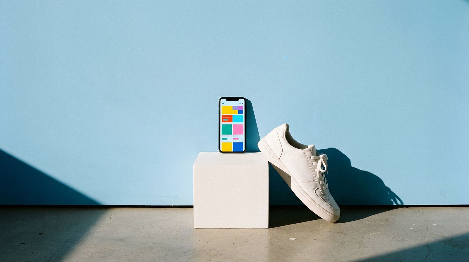
On most of the stores we work on, more than half of all sessions that end in a purchase pass through a product page. Collection pages and home pages get the design attention, but the product page does the selling. It is also the page most likely to be a lightly edited theme default.
Here is what we have learned from designing and rebuilding product pages for fragrance, footwear, furniture and food brands, and the changes we make first.
The first screen has one job
On a phone, the first screen of a product page should answer three questions without scrolling: what is it, what does it cost, and how do I buy it. That sounds obvious, but we regularly inherit pages where the price sits below a carousel of six lifestyle images, or where the add-to-bag button hides behind a size selector that opens a full-screen sheet.
- The product name and a one-line description of what it is for.
- The price, with any free delivery threshold, close to the name.
- The main variant choice (size, colour or format) visible, not hidden in a dropdown.
- The add-to-bag button, which stays on screen on mobile once the page scrolls.
Everything else, including the long description, the brand story and the reviews, can sit further down. Visitors who want it will scroll for it.
Images that answer questions
Most product galleries are full of photographs that show the product looking good. Few show what customers actually want to know. For footwear, that means the sole, the heel from behind and the shoe on a foot at the size most people buy. For fragrance, the size of the bottle in a hand. For furniture, the piece in a room with something of known size beside it.
We brief photography around the questions customer service receives. If the team is asked “how big is it?” ten times a week, there is a missing image.
“Every question your customer service team answers by email is a sentence or a photograph missing from the product page.”
Daniel Cheng, Lead developer, ShopifyWrite for the doubt, not the brand
Brand copy belongs on the product page, but it should come after the practical details. Shoppers on a product page are close to buying and looking for a reason not to. The copy that converts addresses those reasons directly: sizing advice, materials, care, delivery times and returns.
On a footwear store we rebuilt last year, moving a short fit note (“runs small, most people size up by half”) from a tab to the space beside the size selector cut size-related returns noticeably within a season. It was nine words long.
Make reviews useful
Star ratings near the title help, but the reviews themselves only help if people can find the relevant ones. Let shoppers filter by size bought, by use or by skin type, depending on the product. Show the number of reviews, not just the average. And reply to the critical ones: a calm, helpful reply to a two-star review does more for trust than a page of five-star ones.
Photo reviews are worth asking for. A short follow-up email two weeks after delivery, with a direct link to upload a picture, usually lifts the share of reviews with photos more than any discount code does.
Speed is part of the design
Product pages carry the heaviest images on the site and, usually, the most apps: reviews, upsells, size guides, wish lists and chat. Each one loads its own script. Before adding another app, we ask whether the theme can do the job natively. Online Store 2.0 sections and metafields now cover size guides, product badges and related products without any third-party code.
We aim for the main product image to appear within two and a half seconds on a mid-range phone over a mobile connection. When it does, everything else on the page has a chance to work.
What we test first
When a client asks where to start, we suggest running these tests in this order, one at a time, for at least two full weeks each:
- An add-to-bag bar that stays on screen on mobile.
- Delivery and returns information beside the button rather than in a tab.
- Variant swatches instead of a dropdown.
- A reordered gallery that leads with the most informative image, not the prettiest.
- Review filters for the attribute customers ask about most.
None of these is clever. Together, they are usually worth more than a full redesign of the home page, and they can be live in weeks rather than months.